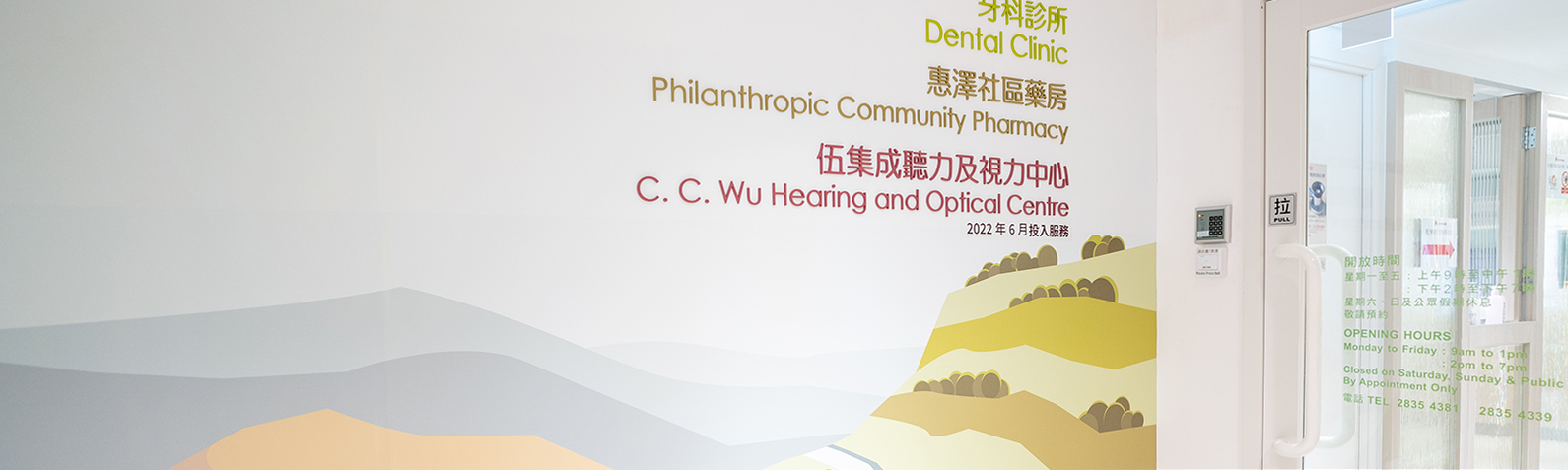
Deliver Information on Elderly Health Services with Clean, Purposeful Design 以簡潔設計傳遞高齡健康服務資訊
SJS C. C. Wu Hearing and Optical Centre 聖雅各福群會伍集成聽力及視力中心
Background背景
Established in 2022, the St. James' Settlement C. C. Wu Hearing and Optical Centre helps the elderly and community alleviate the inconveniences and discomforts of ageing. Services include seminars, screenings, professional exams, treatment referrals, assistive device fittings, and health education. As a new service expanding into the community, the Centre needed a platform to connect with its audience and establish a credible, professional presence.
聖雅各福群會伍集成聽力及視力中心於2022年成立,致力為長者及社區人士紓解因老化帶來的不便及身體不適,服務涵蓋講座、篩查、專業檢查、轉介專業治療及選配輔助儀器等,並教育公眾健康知識。作為新成立的社區服務,中心需要建立網上平台,與服務對象建立聯繫,並樹立可信賴的專業形象。
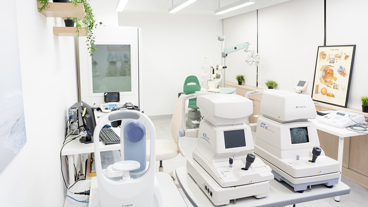
The centre features advanced medical devices and equipment to serve the public. Photo credit: SJS C. C. Wu Hearing and Optical Centre 中心配有多款先進儀器為市民服務。照片來源:聖雅各福群會伍集成聽力及視力中心
Project Objective目標
A Clean and User-Friendly Website 清晰簡潔的網站
As part of expanding its services, the Centre needed a platform to connect with its audience and showcase its mission, values, and services. The goal was to deliver a clear, simple website to help more people understand and benefit from its offerings — while providing educational resources on hearing and vision health, and reinforcing a trustworthy brand image.
作為新服務的投入和拓展,中心需要一個平台來與服務對象及其家人建立聯繫,並展示使命、價值觀和服務。這次項目透過建立網站,為機構提供一個清晰簡潔的方式,讓更多社會人士了解並受益於該服務,同時提供有關聽力與視力健康的教育資源,建立專業可靠的品牌形象。
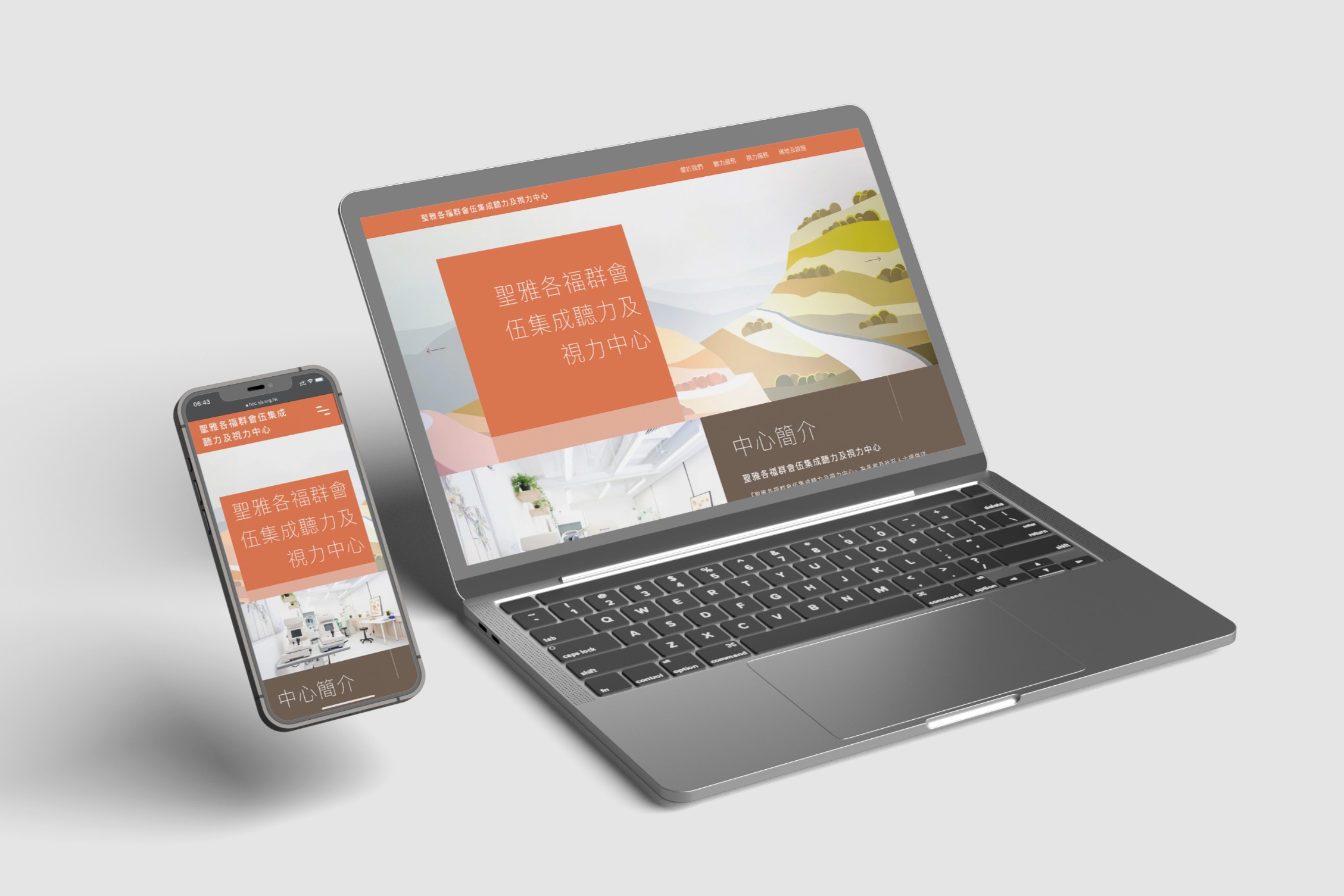
A clean, user-friendly website to connect the Centre with elderly users and their families. 一個簡潔易用的網站,讓中心與長者及其家人建立聯繫。
Design Concept設計概念
Incorporating the Brand Elements of St. James' Settlement and the C. C. Wu Cultural & Education Foundation Fund 結合聖雅各福群會與伍集成文化及教育基金的品牌元素
The website uses a colour palette of orange, green, and yellow to commemorate the collaboration between St. James' Settlement and the C. C. Wu Cultural & Education Foundation Fund — yellow representing hearing, green symbolising optical services. Custom icons, high-quality images, and an intuitive layout ensure a seamless user experience. Typography chosen for simplicity and readability makes navigation easy, allowing visitors to quickly find key information.
網站以橙色、綠色和黃色的配色方案為基礎,紀念聖雅各福群會與伍集成文化及教育基金的合作。黃色象徵聽力,綠色代表視光,旨在向訪客傳遞親切且值得信賴的形象,同時有效展示中心的服務內容。設計採用定制圖示、高質量圖片及直觀佈局,確保訪客擁有良好的使用體驗。字體選擇注重簡潔和易讀性,讓使用者可輕鬆瀏覽網站並迅速獲取關鍵資訊。

The Centre's two service areas — hearing and optical — are distinguished using yellow and green respectively. 中心兩大服務範疇——聽力與視力,分別以黃色和綠色區分,清楚向訪客傳達不同服務類型。
The Solution設計成品
An Effective Promotion and Appointment Platform 有效的推廣及預約平台
The website promotes health and wellness, giving visitors easy access to service information and encouraging them to book appointments. With its launch, the Centre can more effectively reach and assist more people in the community, establishing a professional and welcoming brand presence.
網站的設計專注於推廣健康與福祉,讓訪客能輕鬆查詢服務內容,並鼓勵他們預約服務,照顧自己的身體。隨著網站的啟動,中心能更有效地觸及並幫助更多社區人士,建立專業可靠的品牌形象。
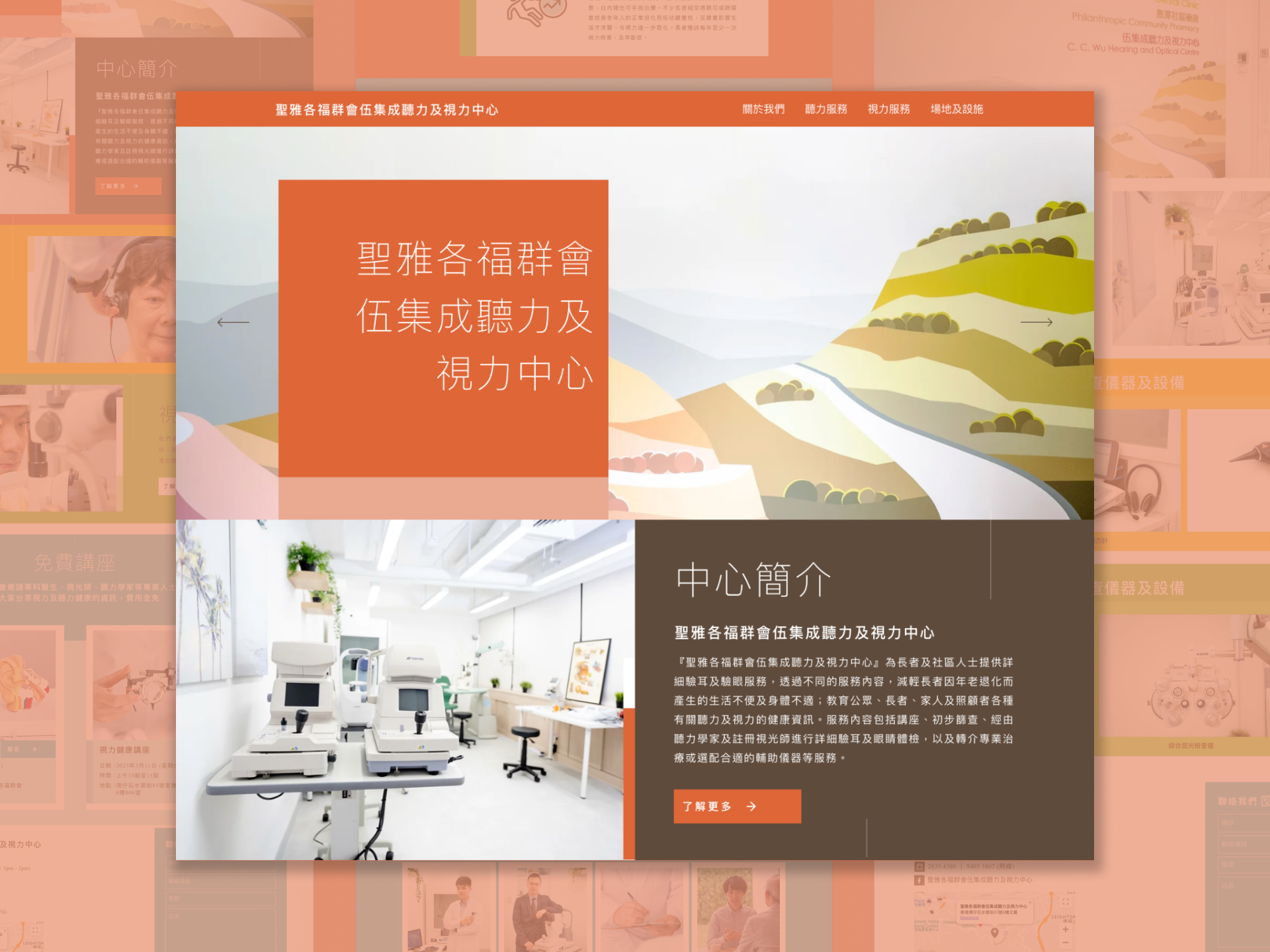
Homepage — vivid colour and a clean, simple interface welcome visitors and set a warm, trustworthy tone. 首頁——以鮮明的色彩及簡潔的介面設計迎接訪客,營造溫暖可靠的形象。
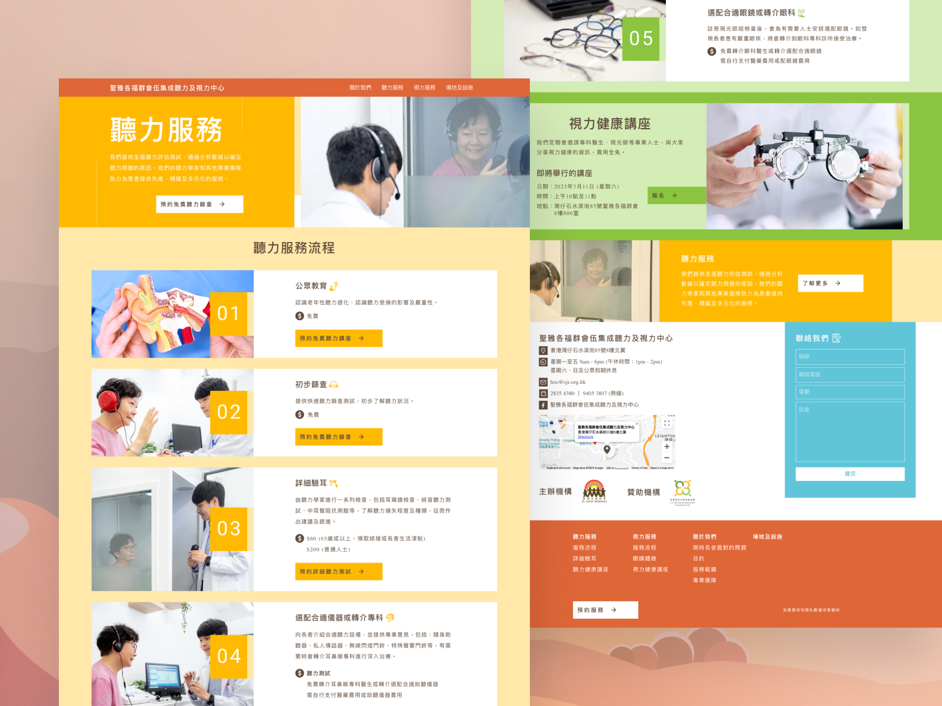
Service pages — a numbered service flow, fee details, and booking buttons let users follow each step at a glance, with yellow for hearing and green for optical. 服務頁面——以編號流程、收費資訊及預約按鈕清楚呈現每個服務步驟,並以黃色代表聽力、綠色代表視光。
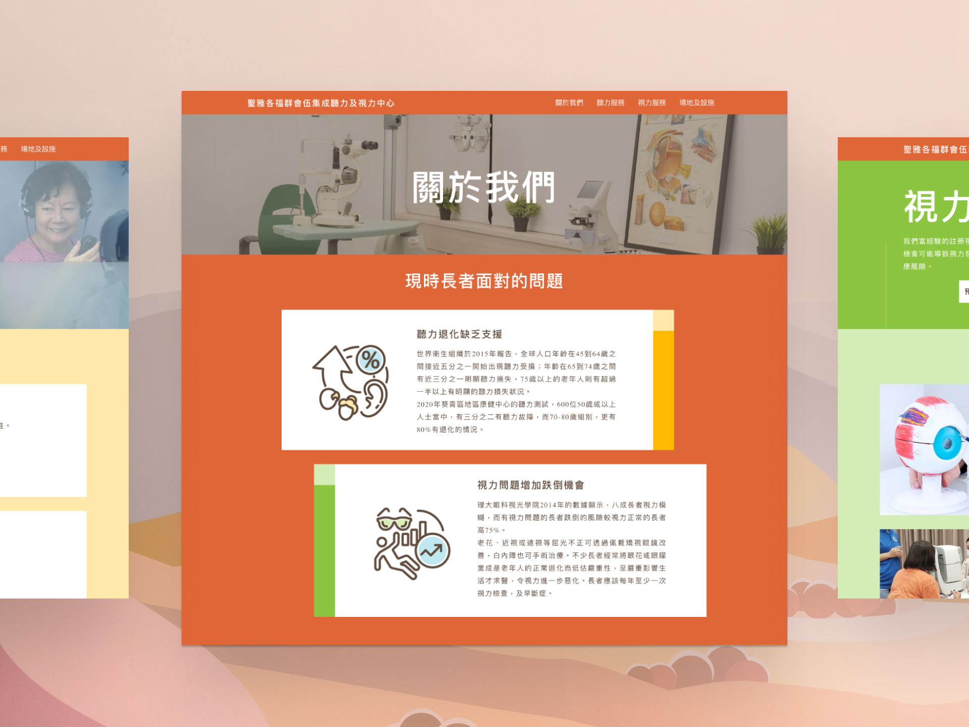
About Us — custom icons and plain-language explanations outline the hearing and vision problems facing the elderly, making health information easy to take in. 關於我們——以訂製圖示及淺白文字說明長者面對的聽力及視力問題,讓健康資訊更易理解。
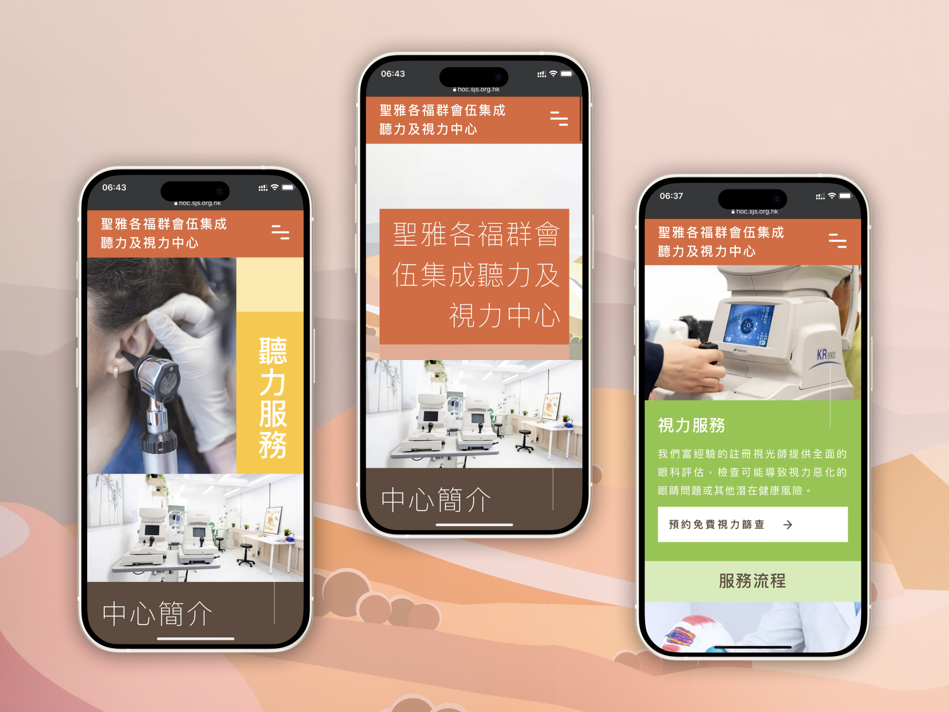
Mobile views — the same colour coding carries across to phones, with large type and full-width buttons that suit older users. 手機介面——相同的色彩區分延伸至手機版面,配以大字體及全闊按鈕,方便長者瀏覽及操作。
Results成果
Between its launch in 2022 and June 2026, the website attracted over 30,000 sessions and reached more than 21,000 unique visitors — with over 300 elderly clients contacting the Centre directly through the website enquiry form.
自2022年上線至2026年6月,網站累計錄得逾30,000次瀏覽,觸及超過21,000名獨立訪客,並有逾300名長者透過網站查詢表格直接聯絡中心。
Team團隊
Brand Links品牌連結
Get in Touch聯絡我們
Got a project in mind?
Let's chat. 有任何設計需要?
隨時聯絡我們。
Whether you want to discuss your next project or see more of our work, get in touch using the contact form. 無論您想討論新項目,或了解更多我們的作品,都可以透過表格與我們聯絡。
Tell us what you're working on, what you need, and how we can help. 歡迎分享項目詳情,以及您的期望、疑慮、需要的支援等等。
We'll reply within two working days. 我們會在兩個工作天內回覆。