From the Ground Up — A Brand Built for Her Practice 從零打造,屬於她的品牌
Frederique Blanchard Frederique Blanchard
Background背景
Frederique Blanchard is a certified ICF PCC coach with over 700 hours of practice in Executive Coaching, Leadership Development, and Career Transition — dedicated to helping people build the conditions for meaningful and sustainable success. As she launched her own coaching practice, she needed a brand that matched her credibility: polished, warm, and distinctly her own. Tab Tab Studio was brought in to build her brand from the ground up — identity, website, and marketing materials.
Frederique Blanchard 是一位 ICF 認證的 PCC 教練,擁有超過 700 小時的執行教練、領導力發展及職業轉型實戰經驗,致力協助客戶建立有意義且可持續的成功與福祉。在她正式創業之際,需要一套既能展現專業資歷、又具個人溫度的品牌形象。跳制作室受邀從零開始打造她的品牌識別、網站及市場宣傳品。
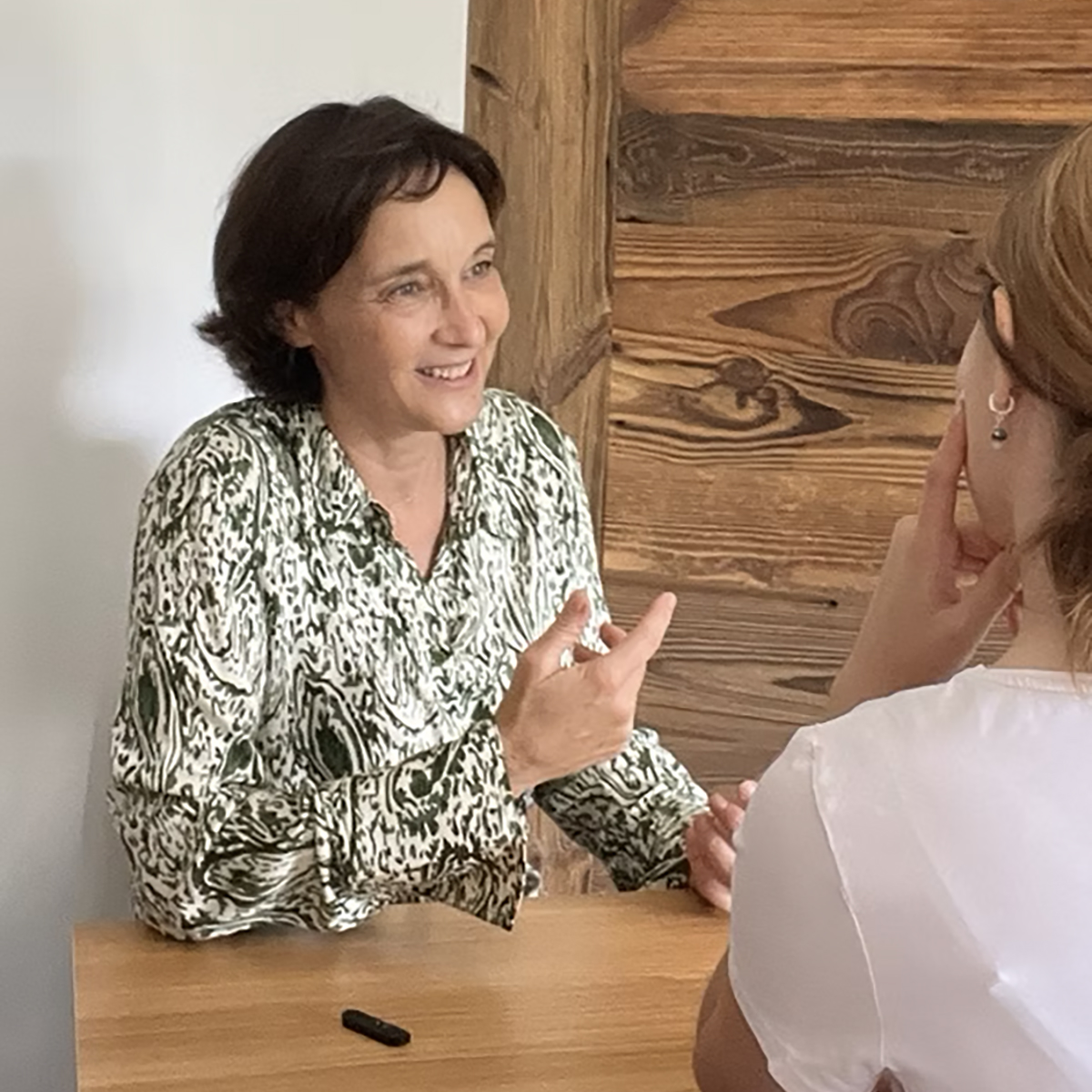
Frederique Blanchard. Photo Credit: Frederique Blanchard Frederique Blanchard 照片來源:Frederique Blanchard
Design Concept設計概念
Elegant. Professional. Distinctly Her. 優雅、專業、獨一無二
After several working sessions with Frederique, we identified five words to anchor the brand: Elegant, Professional, Approachable, Chic, and Dynamic. From there, we built a palette of forest green, light pink, and white — light and modern, with enough warmth to feel welcoming. A custom line icon set added refinement across web and print. Photography guidelines focused on clean, well-lit moments — happy or quietly thoughtful — always incorporating the brand colours. The result is a visual language that feels quietly confident: not self-promotional, but unmistakably Frederique.
經過多次深入討論後,我們確立了五個關鍵詞來定義品牌特質:優雅、專業、平易近人、時尚及充滿活力。以此為基礎,我們選用了森林綠、淡粉色及白色的輕盈配色,既現代又不失溫度。一套精緻的線條圖示貫穿網站與印刷品設計,提升整體質感。攝影方向則聚焦於乾淨、光線充足的瞬間,呈現愉快或若有所思的神情,並融入品牌色彩。最終呈現的視覺語言低調而自信——不是在推銷,而是展現真實的 Frederique。
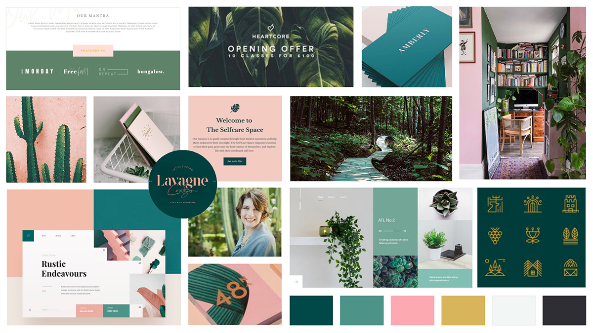
Moodboard defining the Frederique Blanchard visual style. 定義「Frederique Blanchard 風格」的情緒板。
The Solution設計成品
A Complete Brand, Ready to Work 一套完整品牌,即時投入使用
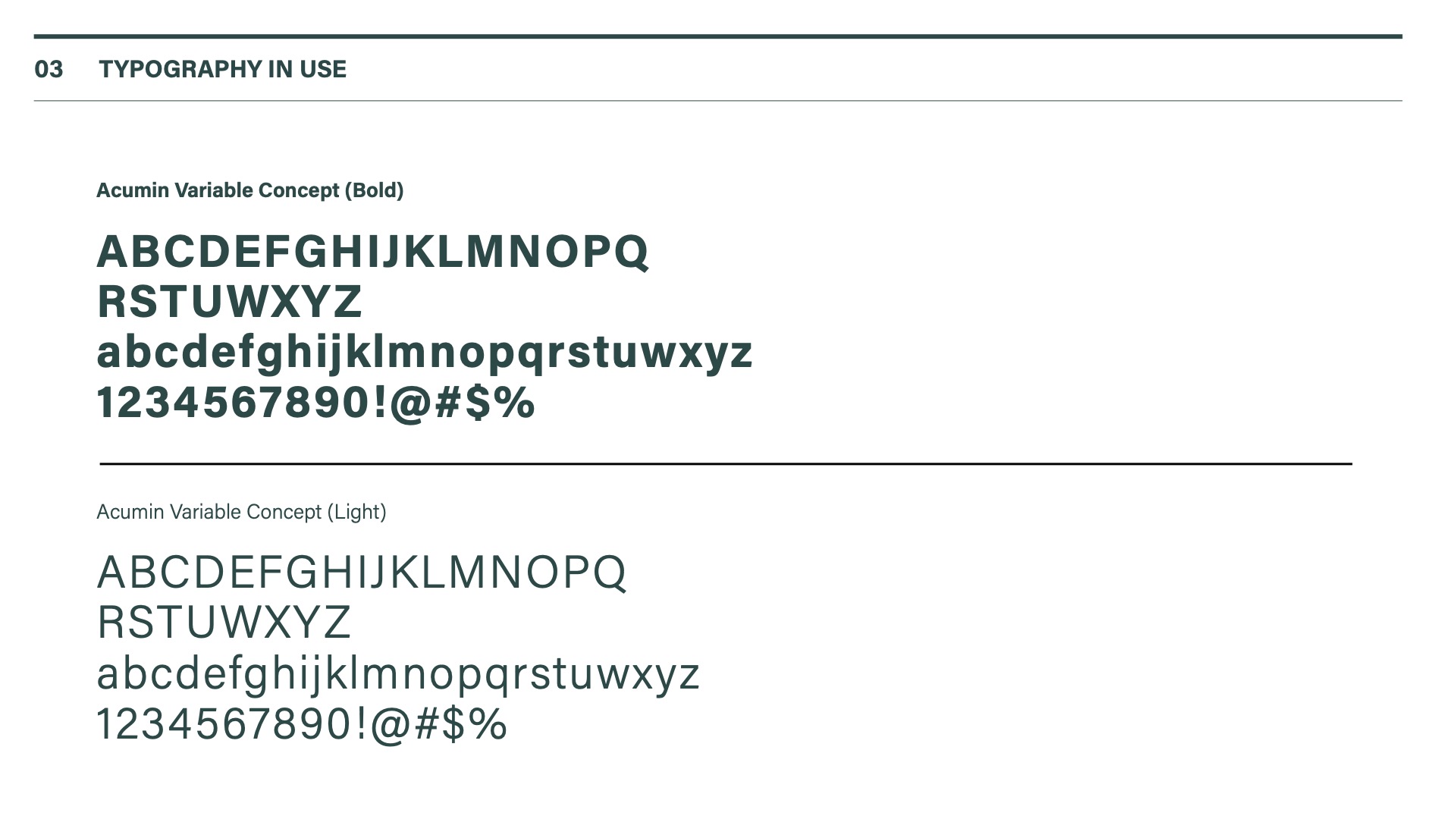
We delivered a full visual identity system for Frederique Blanchard: a custom logotype, colour palette, typography system, line icon set, business cards, stationery set, and a complete website. Typography pairs a serif headline with a sans-serif body — approachable but professional. Every element was built to work together, so Frederique could show up consistently across every channel from day one.
我們為 Frederique Blanchard 交付了完整的視覺識別系統:訂製標誌、配色方案、字體系統、線條圖示組合、名片、文具套裝及完整網站。字體設計採用襯線標題搭配無襯線正文,在親和力與專業感之間取得平衡。所有元素均設計為相互配合,讓 Frederique 從第一天起便能在各個渠道保持一致的品牌形象。
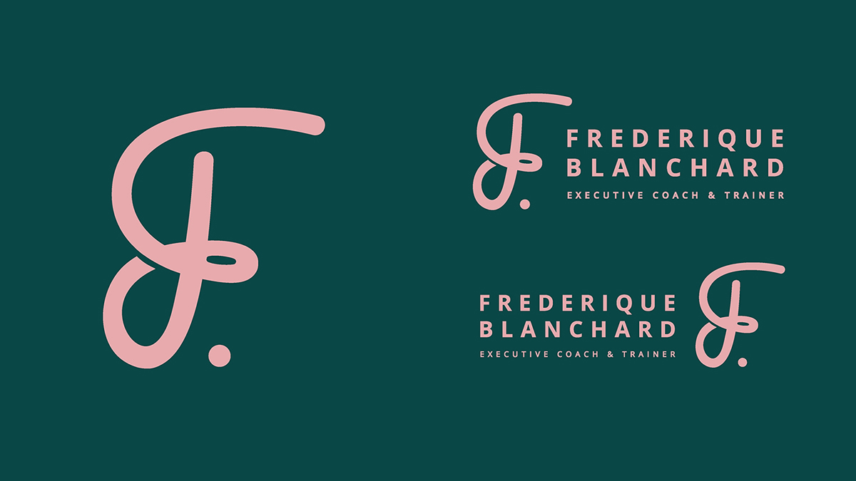
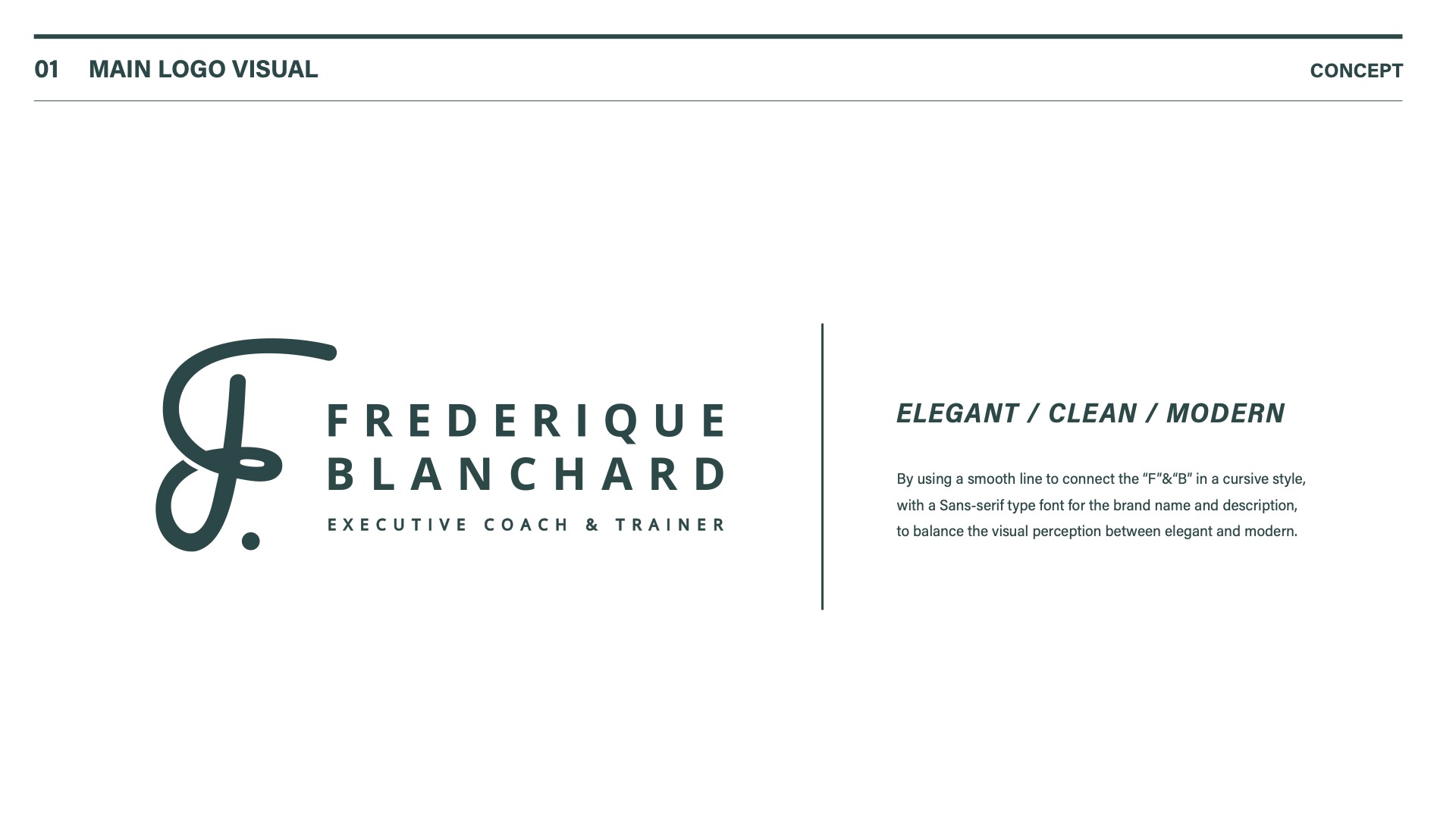
The logo connects "F" and "B" in a fluid cursive line, paired with a sans-serif wordmark — balancing elegance and modernity. 標誌以流暢線條將「F」和「B」以手寫體連接,搭配無襯線字體品牌名稱,達成優雅與現代的視覺平衡。
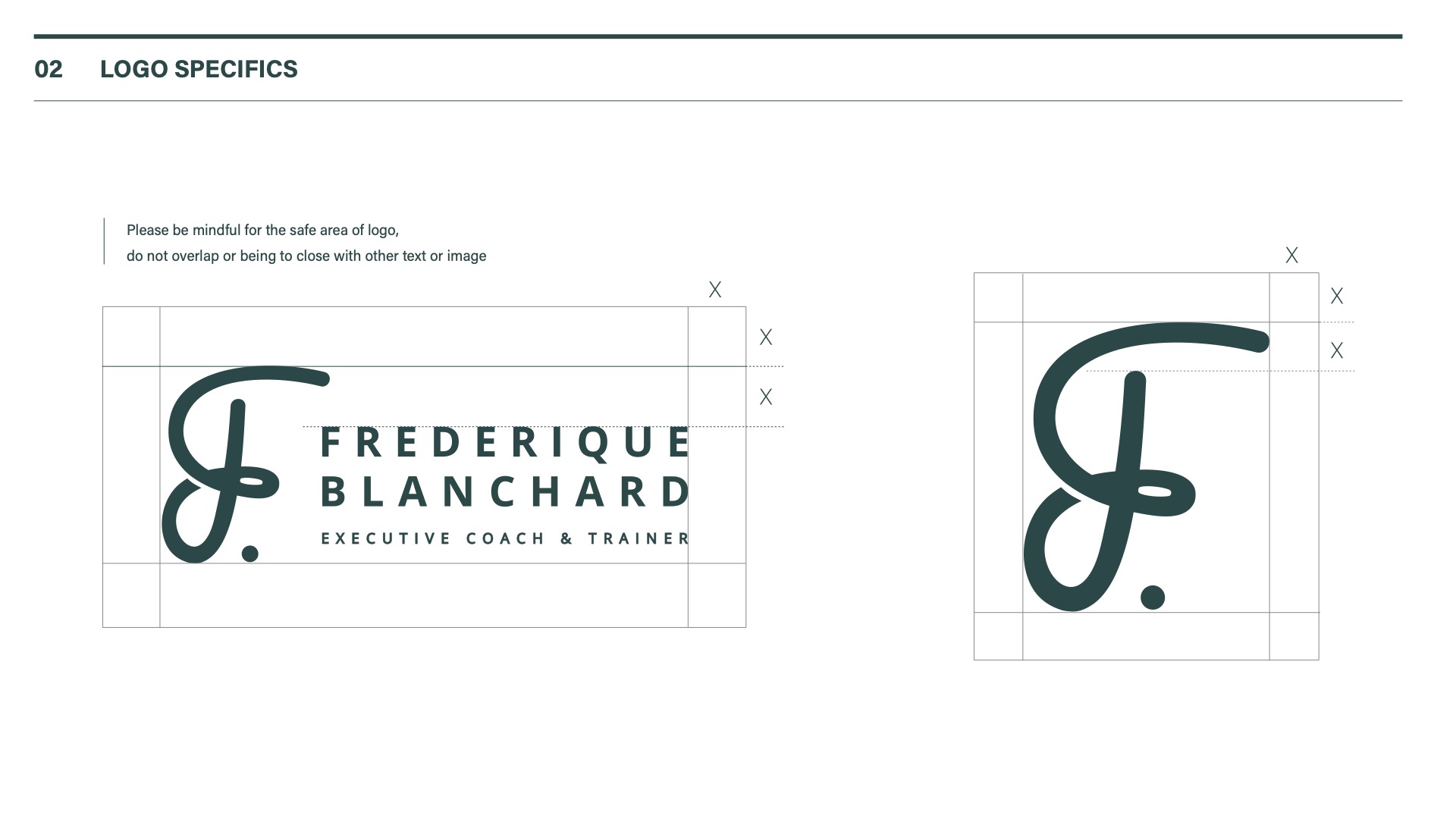
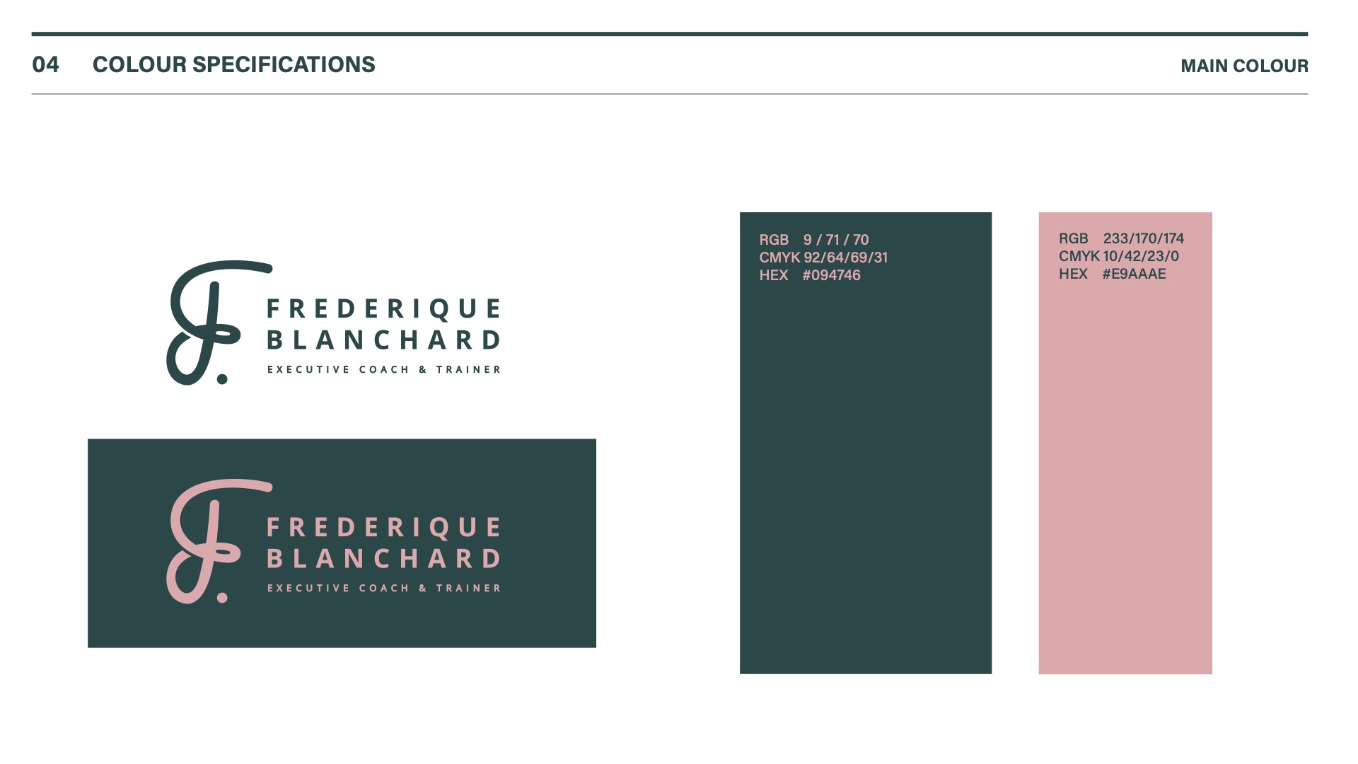
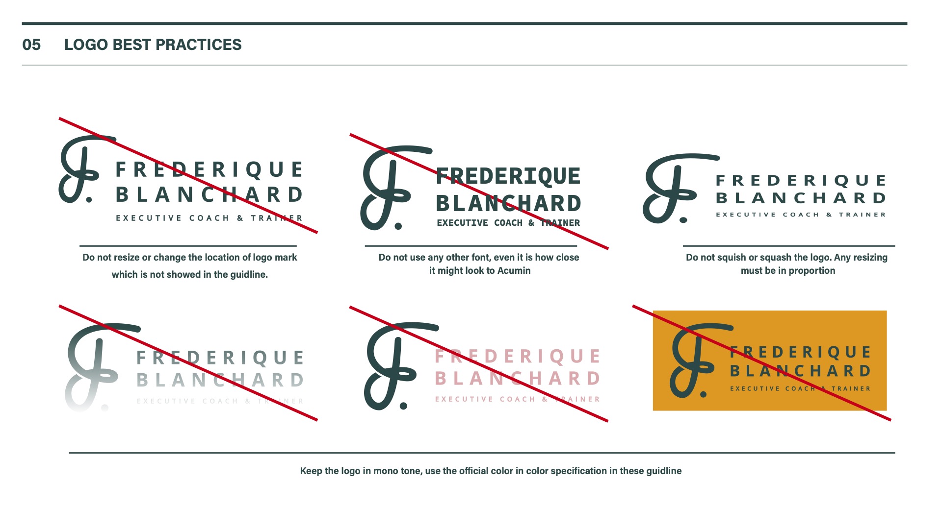
Logo usage guide — showing how the mark is applied across contexts. 標誌使用指南——展示品牌標誌在不同場景下的應用方式。
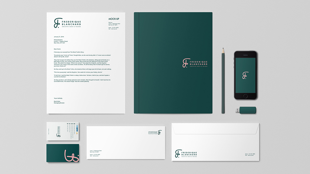
Stationery set applying the visual identity across business cards and branded materials. 文具套裝將視覺識別應用於名片及品牌宣傳品。
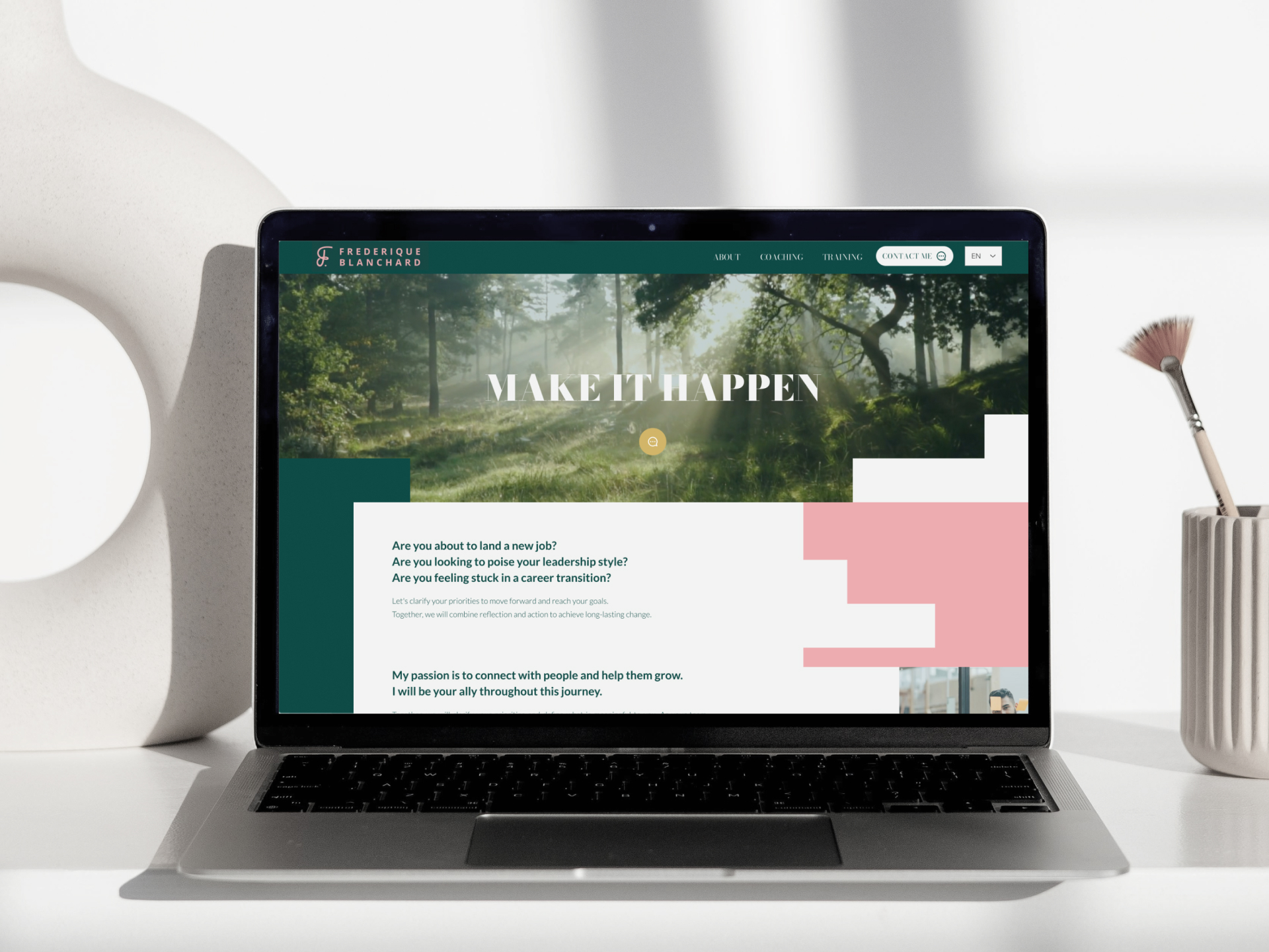
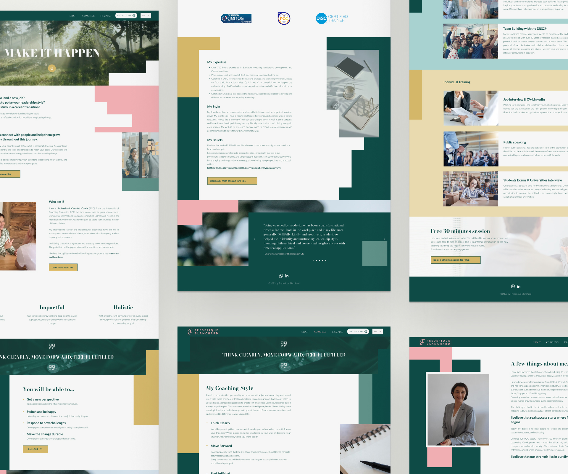
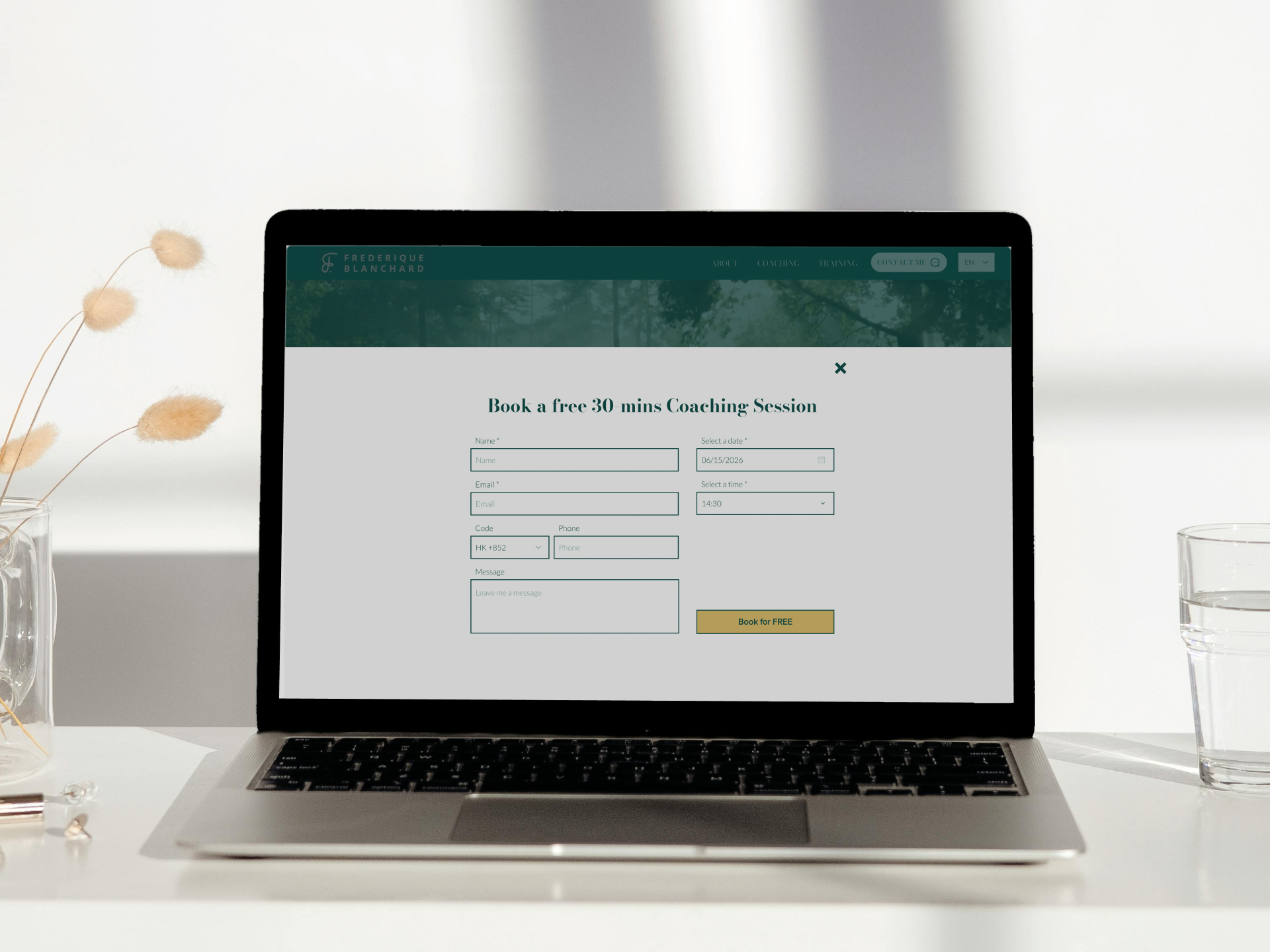
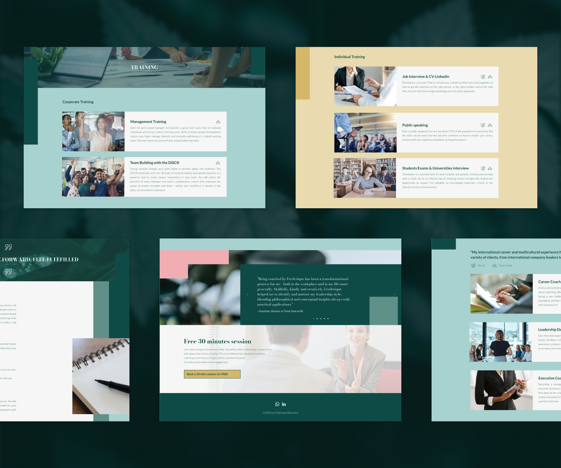
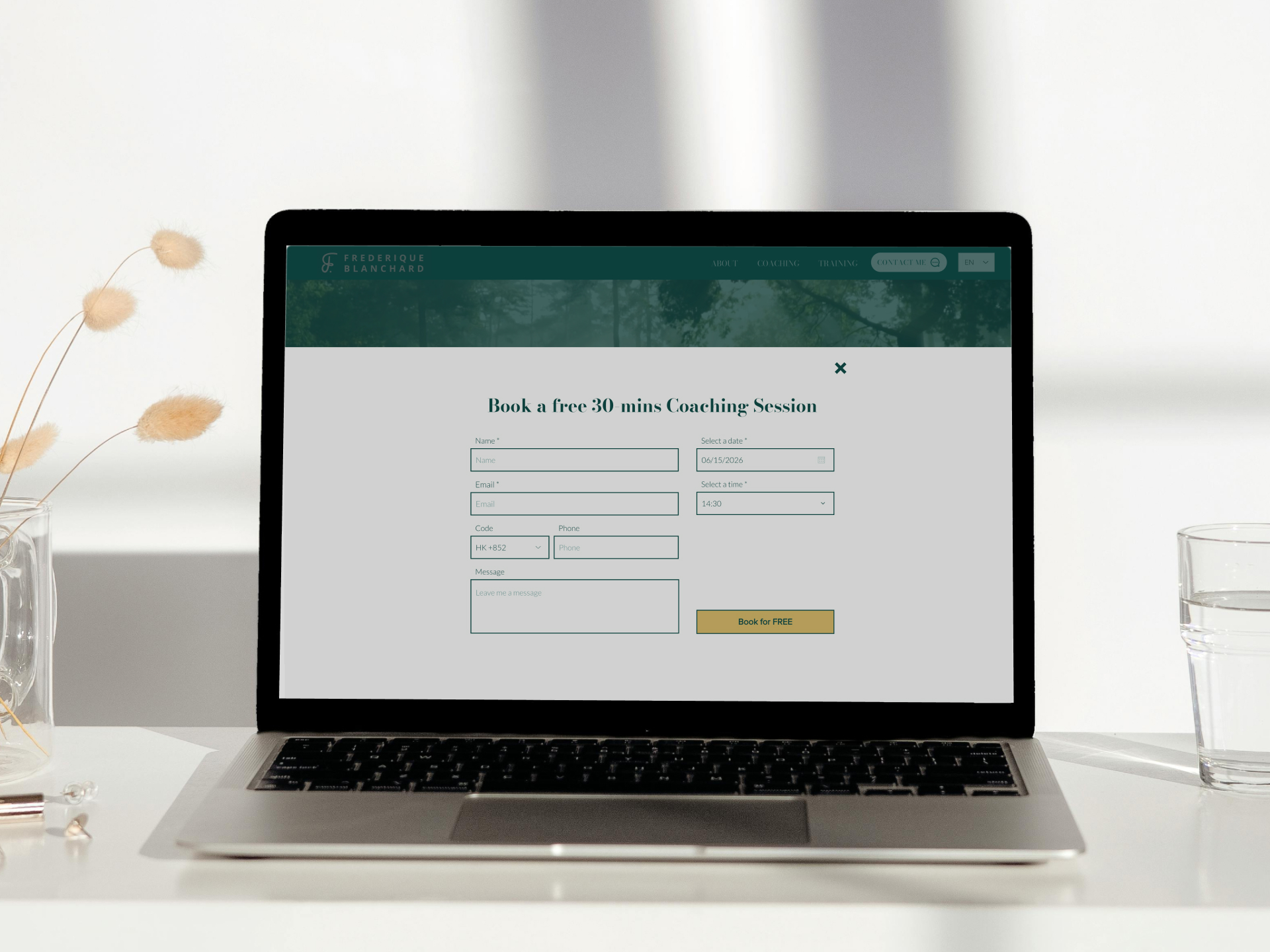
The website maintains the same visual language throughout, creating a consistent brand experience for every visitor. 網站全程保持一致的視覺風格,為每位訪客提供完整的品牌體驗。
Team團隊
Brand Links品牌連結
Get in Touch聯絡我們
Got a project in mind?
Let's chat. 有任何設計需要?
隨時聯絡我們。
Whether you want to discuss your next project or see more of our work, get in touch using the contact form. 無論您想討論新項目,或了解更多我們的作品,都可以透過表格與我們聯絡。
Tell us what you're working on, what you need, and how we can help. 歡迎分享項目詳情,以及您的期望、疑慮、需要的支援等等。
We'll reply within two working days. 我們會在兩個工作天內回覆。