
Create a Warm and Vibrant Website for Young People 打造溫暖活力的青年服務網站
St. James Settlement Youth Service 聖雅各福群會青年服務
Background背景
St. James Settlement Youth Service was established in 2001 to provide diverse services to children and young people aged 6 to 24. As the organisation expanded, its website fell behind — outdated content, a structure that no longer reflected the range of services, and a visual language that had not kept pace with the team it represented. A full redesign was needed: one that could showcase the organisation's mission and services clearly, and build a stronger connection with the community it serves.
聖雅各福群會青年服務於2001年成立,為6至24歲的兒童及青少年提供多元化服務,持續以創新方式協助年青人認識自我、發展潛能,並對社區作出貢獻。隨著服務不斷擴展,官方網站的資訊未能同步更新,需要全面改造及重組架構,以有效展示機構的使命、價值觀和服務,並與社區建立更緊密的聯繫。
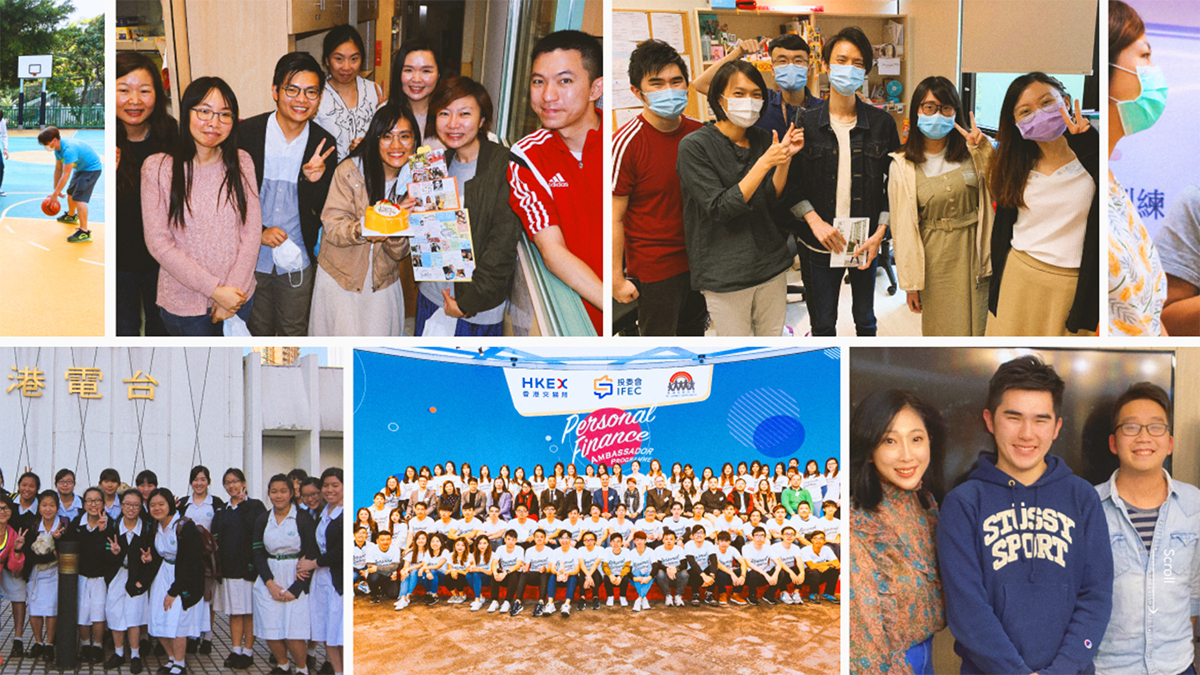
Photos of each youth service team. Photo Credit: St. James Settlement Youth Service 各個青年服務單位的照片。照片來源:聖雅各福群會青年服務
Project Objective目標
A New Visual Identity to Reach the Right Audience 以新視覺識別觸及目標受眾
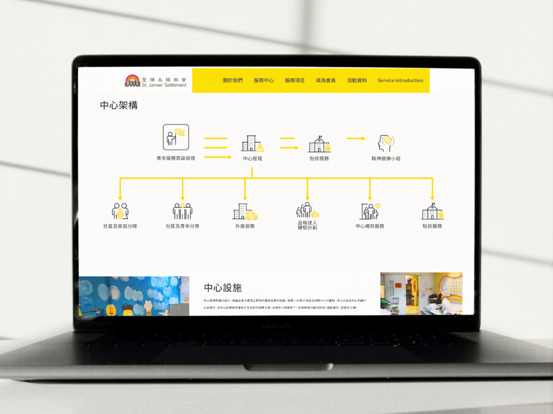
Develop a new visual identity for the Youth Service that reflects its core values — Love, Respect, Dream, Integrity, and Excellence. Restructure the site architecture so that every service unit and centre has a clear, dedicated space. Build a content management framework that social workers can maintain without design support. Deliver a fully responsive site, given that most of the target audience browse on mobile.
為青年服務建立全新視覺識別,以反映機構的核心價值——愛、尊重、夢想、誠信、精益求精。重組網站架構,確保各服務單位和中心均有充足展示空間。為社工提供易於維護的內容管理框架,方便定期更新服務及活動資訊。同時採用響應式設計,照顧以手機瀏覽的年輕受眾。
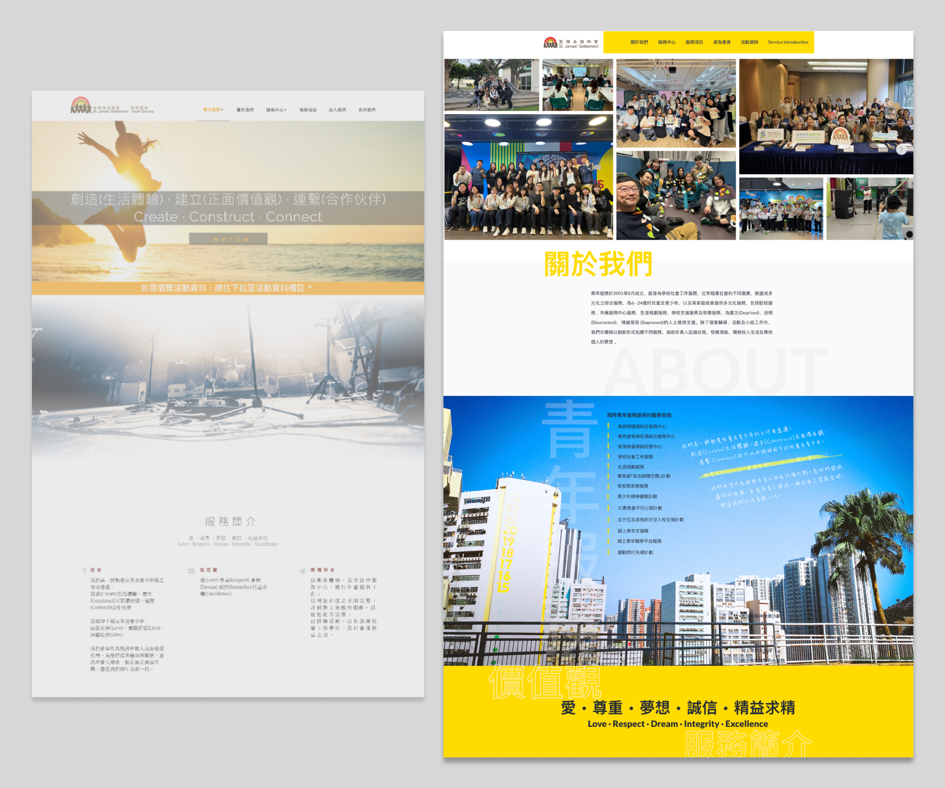
Before and after comparison of the website restructure. 網站重組前後對比。
Design Concept設計概念
A Website That Feels Like a Letter from a Friend 讓網站成為一封來自好友的信
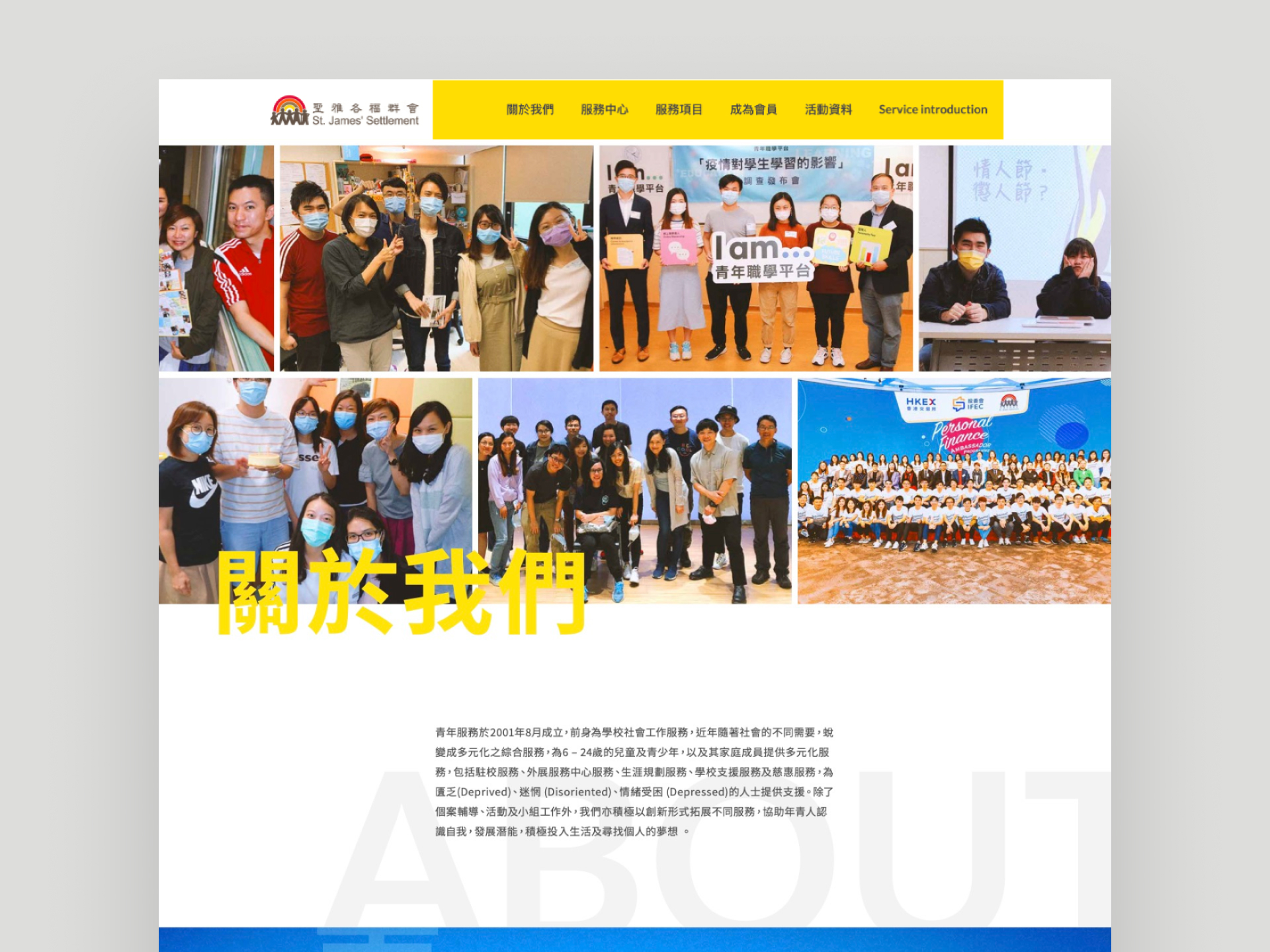
The design is anchored in warmth and energy. The colour palette pairs high-contrast yellow, white, dark grey, and dark blue: vibrant yellow for optimism and momentum, white for a clean backdrop that lets content breathe, and dark blue to signal trustworthiness. To make the site feel personal rather than institutional, we wove in photographs of real youth activities throughout — diverse, candid, and full of life. Handwritten details and considered typographic touches complete the effect, giving the site the feel of a letter from a trusted friend rather than an official notice board.
設計以「溫暖」和「活力」為核心。色調採用高對比的黃色、白色、深灰色與深藍色:鮮明的黃色傳遞機構的活力與樂觀,白色構建簡潔的背景讓內容突出,深藍色則強調機構值得信賴的一面。為增添個人化感覺,整個網站融入大量展示多元青年活動的照片,並加入手寫字句和精緻細節,讓訪客感受如收到一封來自好友的信的溫暖。
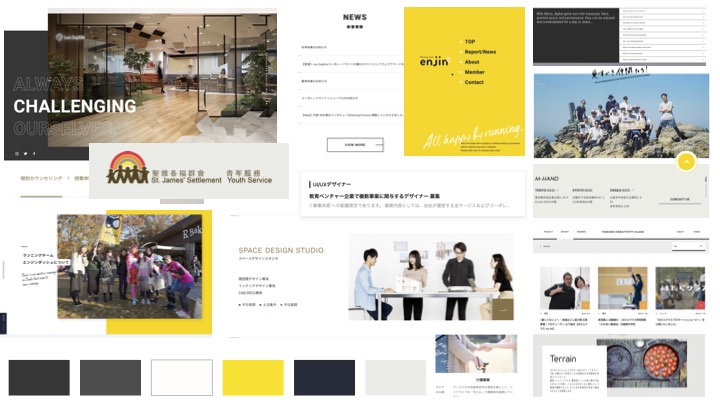
Overview of the colour system and visual style direction. 色彩系統及視覺風格概覽。
The Solution設計成品
Restructured to Reach 重組架構,觸及目標受眾
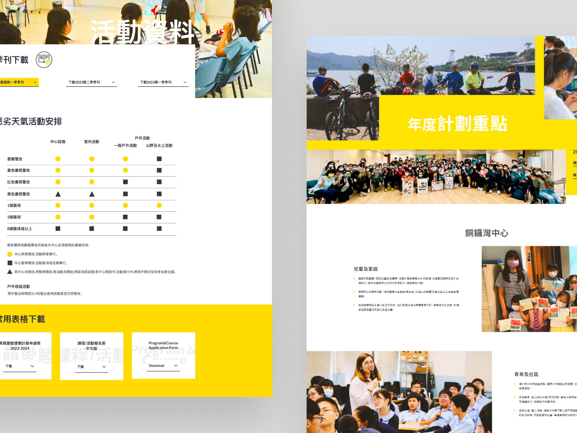
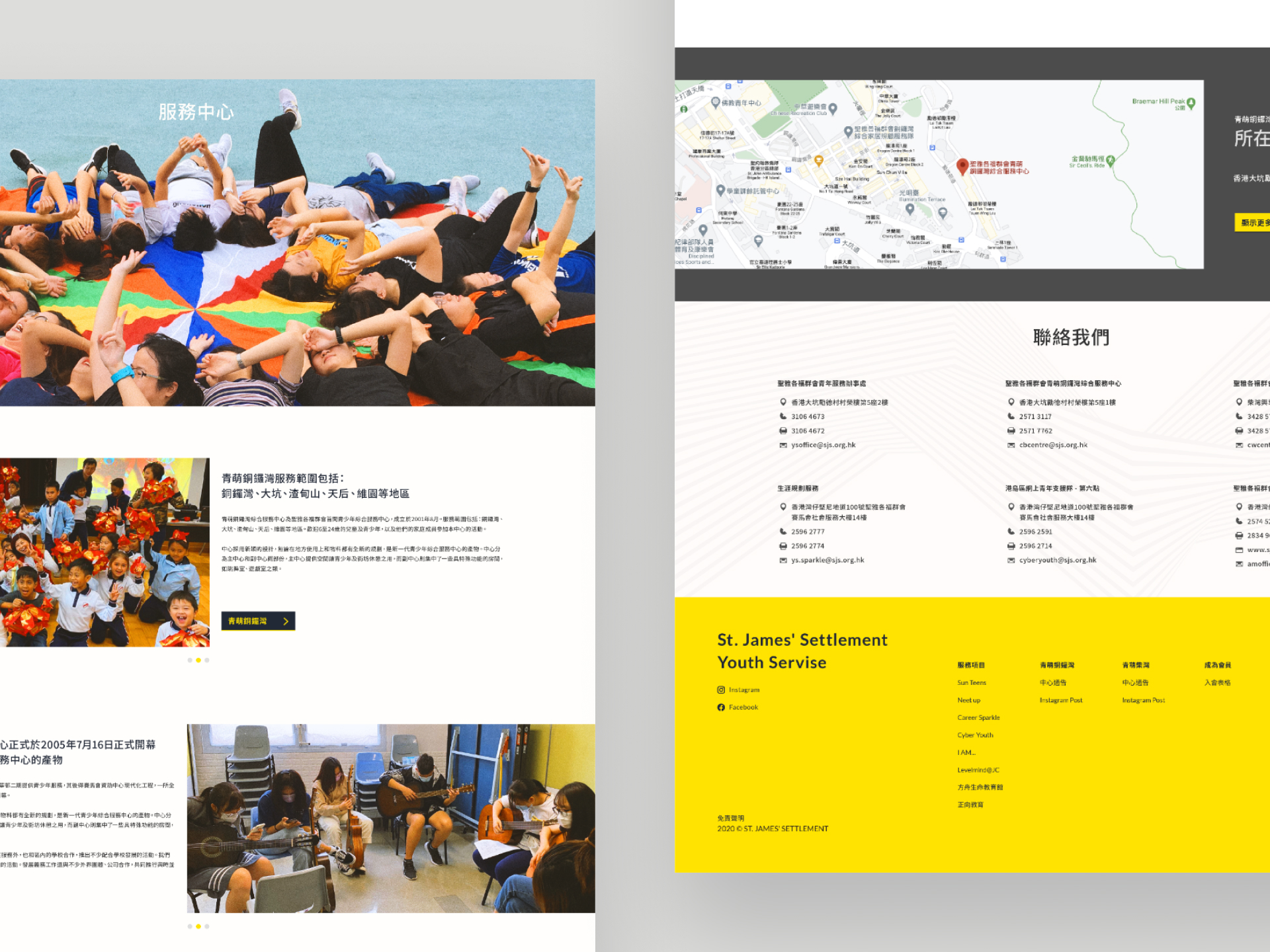
The new website creates a warm, youthful atmosphere while giving the restructured layout room to breathe. Every service unit and centre now has adequate display space, and social workers can update content without relying on a designer. The site is built responsive throughout — a deliberate decision, given that most young people in Hong Kong browse on their phones. The result is a website that helps St. James Settlement Youth Service reach its audience, raise the visibility of its mission and services, and give visitors a clear reason to get involved.
新網站的設計創造出溫馨而年輕化的氛圍,重組後的架構讓各服務單位和中心均獲得充足的展示空間,社工亦可輕鬆更新資訊,持續提供最新的服務及活動詳情。考慮到大多數年輕人以手機上網,網站全面支援響應式設計,確保在任何裝置上都能流暢瀏覽。這個網站協助聖雅各福群會青年服務接觸其目標受眾,提升機構使命與服務的知名度,並激勵訪客積極參與,對社區產生正面影響。
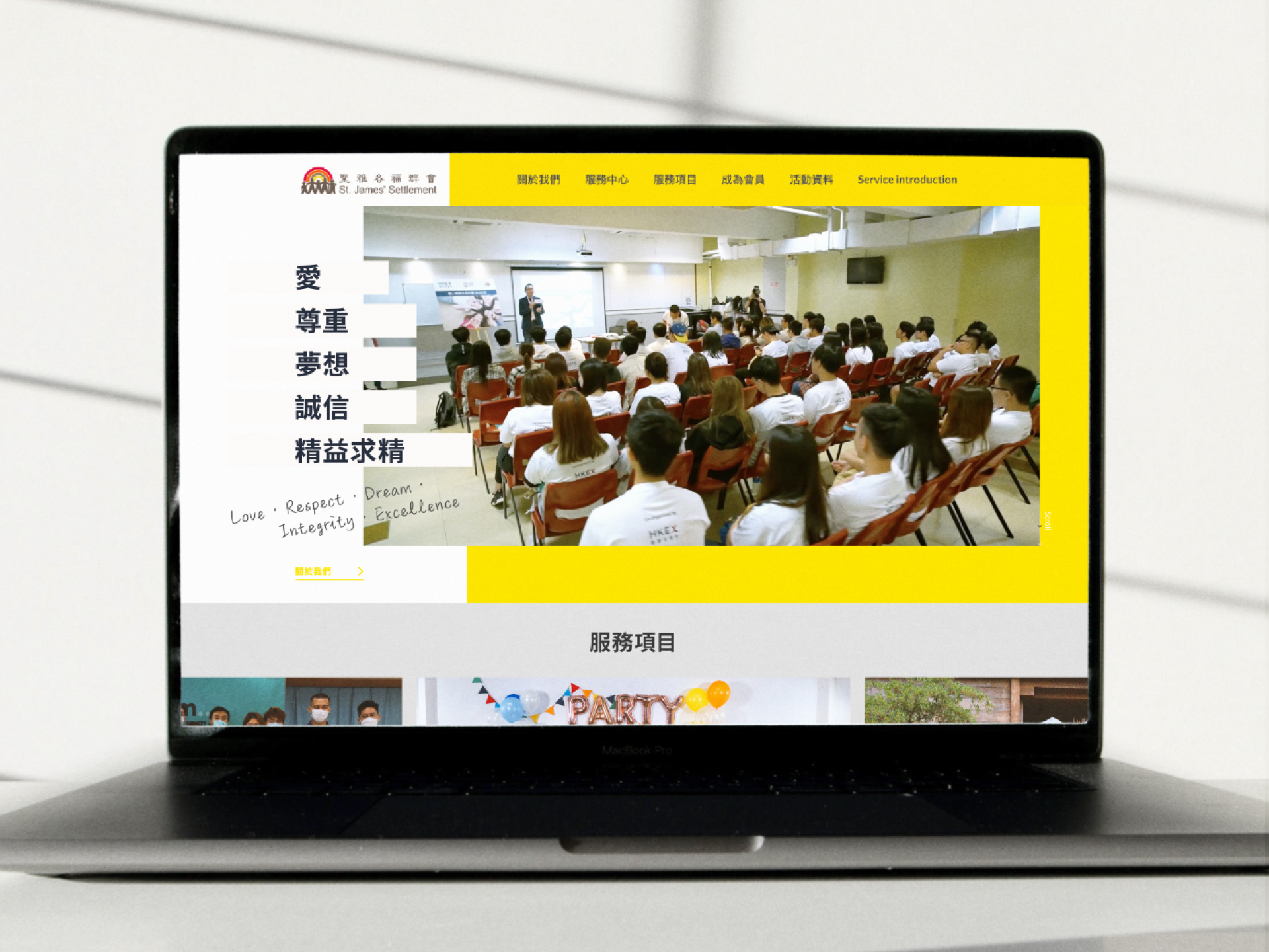
The homepage features a video and high-contrast colour palette to convey the organisation's youthful brand image. 網站首頁加入影片和高對比度色彩搭配,突顯機構充滿活力的品牌形象。
Results成果
Since launch in 2021, the website has grown steadily — reaching over 7,700 sessions and 5,300 unique visitors in 2023. Traffic has remained consistent year on year, reflecting the site's role as a reliable resource for the young people and families the organisation serves.
網站自2021年上線以來持續增長——2023年錄得超過7,700次瀏覽及5,300名獨立訪客。流量年復一年保持穩定,反映網站已成為機構服務的年青人及其家庭的重要資訊渠道。
Team團隊
Brand Links品牌連結
Get in Touch聯絡我們
Got a project in mind?
Let's chat. 有任何設計需要?
隨時聯絡我們。
Whether you want to discuss your next project or see more of our work, get in touch using the contact form. 無論您想討論新項目,或了解更多我們的作品,都可以透過表格與我們聯絡。
Tell us what you're working on, what you need, and how we can help. 歡迎分享項目詳情,以及您的期望、疑慮、需要的支援等等。
We'll reply within two working days. 我們會在兩個工作天內回覆。